Let’s talk a little bit about quilt designs. Of the quilting variety. Not the piecing variety. How many of us struggle with keeping our quilting plans fresh and unique? If you’re anything like me, you might be constantly on Instagram or Pinterest searching through “free motion quilting” posts or “custom quilting” or “longarm quilting”, or any other search request you can think of. And while I don’t ever want to copy someone else’s work, I’m always trying to find my own voice through things I like in other quilters’ work.
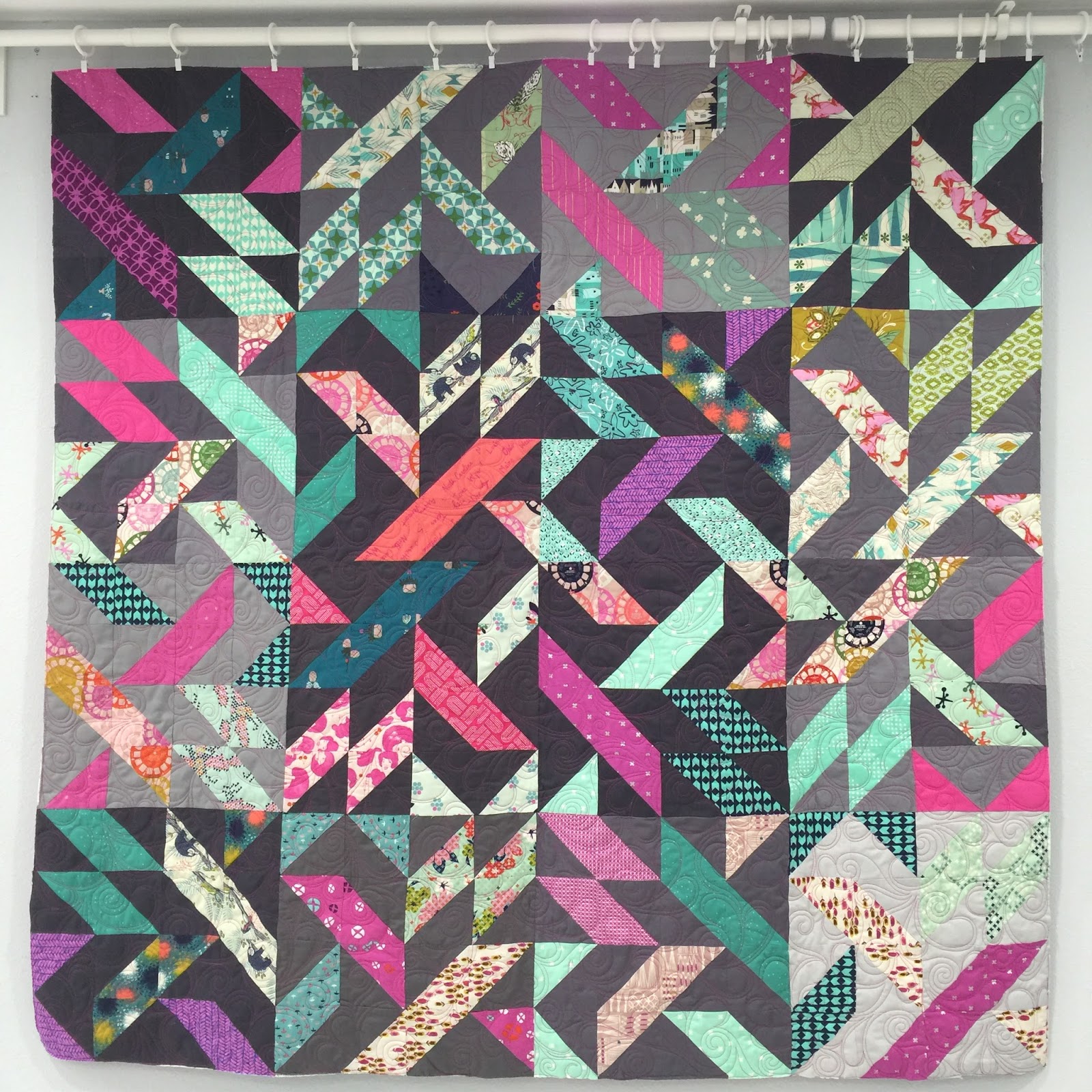
I’m often blown away by tedious, tiny, overthought, quilted to death quilts. I know I don’t charge nearly enough to compensate me for my time if I were to quilt every quilt that way. To be honest, I wouldn’t even be able to pay the electric bill! Don’t get me wrong, this is not a post to get on my soap box about charging what you’re worth. I just want to discuss simplicity in quilt design. I chose one of the quilts I quilted this year, that honestly, isn’t a show quilt–it isn’t a mind blowing quilt design, but it is thoughtful enough to look good (in my opinion).
Isn’t the purpose of a good quilter to make the designer/piecer’s work shine? To make the block or the quilt look it’s absolute best?
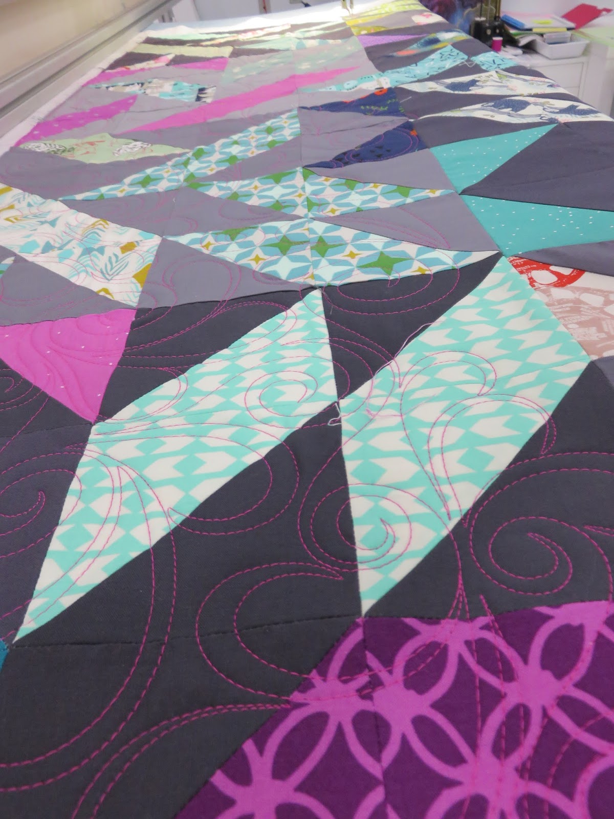
I chose two motifs do be used on this quilt. One was a continuous loop that was stitched throughout the green pieces on the quilt to give uniformity to the design.
The other motif was simple double wavy lines with curved lines connecting them on the larger pieced blocks. While these two designs won’t be winning any ribbons at quilting shows, I’m sure, it does enough to simply enhance the quilt without drawing so much attention to the quilting that you can’t even see the actual quilt or blocks anymore. I know this is nothing special, but I just want to point out that not every quilt has to be QTD. (Quilted to death)
I recently saw a quilt on Instagram from a quilter I follow on a log cabin quilt. The quilter is extremely talented and really takes quilting to a new level. The log cabin quilt was QTD. Quilted. To. Death. It looks good. But the actual quilt is lost in the quilting. What purpose does this serve? I almost feel like it is just to inflate the ego of the quilter, and maybe the piecer requested this…but I wouldn’t think so. Shouldn’t the piecing and quilting work together to make the quilt balanced overall? I would really like to post a picture of what I’m talking about, but I don’t want to demean anyone’s work.
Also, keep in mind that I’ve only been sewing and quilting since about 2011. So really, in the grand scheme of things, what do I know? 🙂 Just something to chew on and think about when it comes to quilt design…does more sometimes equal less?